Disaster Resilience
and Response Unit
Sydney Local Health District
The Brief
Develop a sub-brand for the Disaster Resilience and Response Unit that community members can recognise and trust. Their work cycles through four stages: prevention, preparedness, response and recovery.
The Solution
I started by ideating a few different logomark concepts that conveyed safety, community and trust. I chose the two strongest options that were on opposing ends of abstract/literal and sought client feedback. Following their insights, I presented another two options, further evolved with mockups to show the brand in-situ. From there, they picked the one shown here.
The Result
The clients were pleased with the final presentation and made their choice promptly. I then supplied them with their artwork logo files along with brand guidelines. This project was a challenging but valuable learning experience about client presentations.

Brand identity
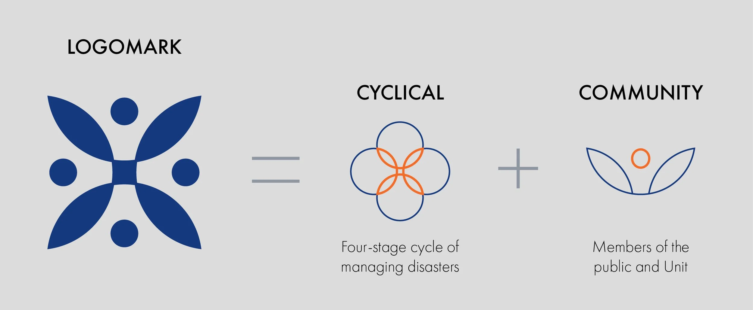
Logomark breakdown

Brand usage guide
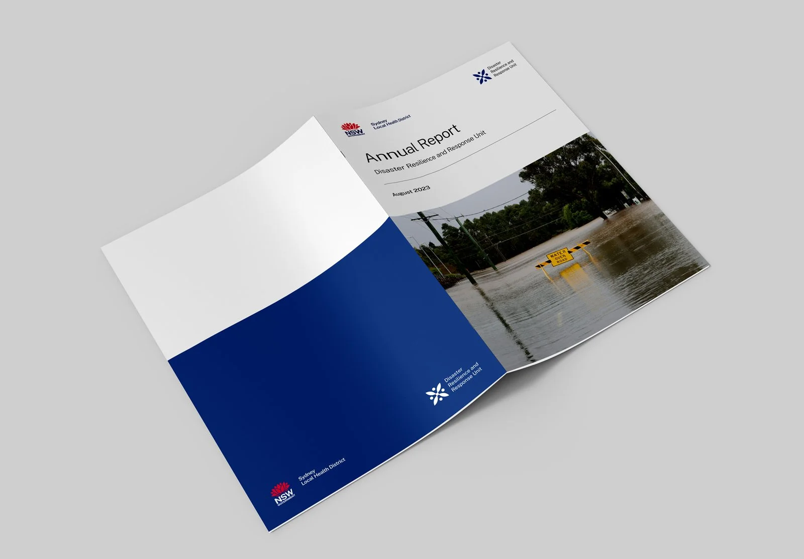
A4 booklet

Polo shirt